Just like everyone else in these comments, I can't thank you enough for putting in so much effort into this page to help other developers to build their game pages. Again thank you so much!!
I have it in my backlog to get some support out there for background images. It's taking a lot longer to get together because it digs more into web design concepts in order to do it right and I just haven't had the time. But, the short version for your specific situation is:
Because of the nature of web design and varying screen width, I would recommend that if you aren't using a background pattern that just repeats across the page, you center the design of your background to work from the center of your page outward towards either edge of your screen. There are some additional tricks you can take advantage, and you can use a much smaller image if you're just trying to create a repeating pattern like horizontal strips going across the page or something like that.
Here's some general things to think about though if you want to have an image that specifically highlights the center area of the page:
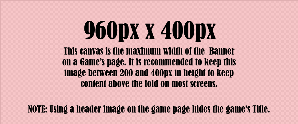
The center section of the page with all your game information (the name for this section is inner_column) is 960px wide on desktop view by default.
If you upload a background image and set its alignment to Center, your background will be placed directly behind and aligned to the center of the inner_column. This means that if your background image is 960px wide it will stay completely hidden behind that column, but if you make it wider, say 980px the center 960px of your background image will be covered by the inner_column, but you'll have 20px peeking out from behind that column on either side.
So, if you want a single centered background image (i.e. no horizontal repeat) you'll want to figure out how much of the background you want to display beyond the 960px on each side and then add that to the 960px for your total width. If you want to have 40px of the background display past either side of the inner_column, you'd take (40px*2)+960px=1040px.
Now the height of your image will depend on the type of background you have and how frequently the repeat is. The smaller and more consistent your pattern the less tall you need your background image to be. Set your background image to repeat vertically.
---
It gets a little messier when considering break points. Game Pages have 3 breakpoints: Desktop, Tablet, Mobile. You can't do much with this unless you are doing custom CSS on your page though. The 2 things to consider are that:
1) for Tablet view the inner column is 600px wide, so a lot more of your background will be displayed, and you may want to consider that when designing it.
2) For the Mobile view, as soon as your window width gets down to 600px the inner_column will fill the entire screen width and none of your background will be displayed unless you've used custom CSS to modify the breakpoint width.
For these reason, if you are trying to add a border to the inner_column, what you'll actually want to use custom CSS for those borders.
Wow, this page is like looking under the couch cushions and finding a $100 bill! Wish I had some of this information earlier! Thanks for the helpful guide!
If you don't have a cover image, your game submission in a game jam will appear as a blank image with the text "no image :(", even if you have screenshots or other images in the screenshot section.
Oh, that's a good thing to note! I should double check what happens on your profile page and in the itch browse results if you don't have a cover image as well.
I'll do some testing and add a section for No Cover Image.
Hey PorcMig! I've started on the background guide, but haven't finished it yet. It's gotten a lot bigger than I originally intended, so it's going to be its own itch project and more of a demonstration with several different approaches and strategies for folks to experiment with rather than a set of templates.
I have most of the walkthrough videos recorded, but haven't finished cleaning them up yet.
May I suggest adding a blurb about color contrast with the background image?
When the image has many colors or has gradients, it can be difficult to read text in front of it. Say for instance you have black text, and your image is a bright white sky above a dark foreboding cave. If the image is static, people reading the text over the dark section of the image may have difficulty making out the text, whereas it will show plainly on the light part of the image.
There are ways around it, like giving your text a single-color background of its own in front of the image. But for the most part, I'd just want designers and developers to be mindful of the potential problem. Could solve a lot of headaches.
This is very convenient for making sure everything looks good on a new page! I'm definitely going to be hanging onto this for the future! Thank you for providing this for everyone!
← Return to tool
Comments
Log in with itch.io to leave a comment.
Just like everyone else in these comments, I can't thank you enough for putting in so much effort into this page to help other developers to build their game pages. Again thank you so much!!
This is glorious.
Thanks a lot :)
You're a gem!! Thank you for this :)
Thank you so much, this makes things much easier!
this is super helpful. Thank you for your thorough guide!
Thank you, this is very informative. You should make one for itch profiles too!
ahh, this page is a lifesaver. i have it bookmarked and keep coming back to it. thanks again
Glad I found this! Thank you!
thank you sooo much!!
This is amazing. Thank you so much!
You're welcome! I'm glad you found it helpful!
Absolutely incredible.
Thank you!
You're welcome! I'm glad you found it helpful!
Thanks so much!!
You're welcome! I'm glad you found it helpful!
There's even Affinity Publisher stuff!? Nice!
Going forward it'll probably be only Affinity, as I've been phasing Adobe out of my working process. I'm glad you found it helpful!
This is really helpful, thanks!
You're welcome! I'm glad you found it helpful!
Thanks!
You're welcome! I'm glad you found it helpful!
Thanks, this is very helpful!
You're welcome! I'm glad you found it helpful!
thank c;
You're welcome! I'm glad you found it helpful!
I didn't know there were this kinds of gem!!! Thank you so much!!!
You're welcome! I'm glad you found it helpful!
Thanks!
You're welcome! I'm glad you found it helpful!
Thanks for the information, my problem is with the background images, I don't know what size they must be to fit correctly on the sides.
Hey J.Pablo!
I have it in my backlog to get some support out there for background images. It's taking a lot longer to get together because it digs more into web design concepts in order to do it right and I just haven't had the time. But, the short version for your specific situation is:
Because of the nature of web design and varying screen width, I would recommend that if you aren't using a background pattern that just repeats across the page, you center the design of your background to work from the center of your page outward towards either edge of your screen. There are some additional tricks you can take advantage, and you can use a much smaller image if you're just trying to create a repeating pattern like horizontal strips going across the page or something like that.
Here's some general things to think about though if you want to have an image that specifically highlights the center area of the page:
The center section of the page with all your game information (the name for this section is inner_column) is 960px wide on desktop view by default.
If you upload a background image and set its alignment to Center, your background will be placed directly behind and aligned to the center of the inner_column. This means that if your background image is 960px wide it will stay completely hidden behind that column, but if you make it wider, say 980px the center 960px of your background image will be covered by the inner_column, but you'll have 20px peeking out from behind that column on either side.
So, if you want a single centered background image (i.e. no horizontal repeat) you'll want to figure out how much of the background you want to display beyond the 960px on each side and then add that to the 960px for your total width. If you want to have 40px of the background display past either side of the inner_column, you'd take (40px*2)+960px=1040px.
Now the height of your image will depend on the type of background you have and how frequently the repeat is. The smaller and more consistent your pattern the less tall you need your background image to be. Set your background image to repeat vertically.
---
It gets a little messier when considering break points. Game Pages have 3 breakpoints: Desktop, Tablet, Mobile. You can't do much with this unless you are doing custom CSS on your page though. The 2 things to consider are that:
1) for Tablet view the inner column is 600px wide, so a lot more of your background will be displayed, and you may want to consider that when designing it.
2) For the Mobile view, as soon as your window width gets down to 600px the inner_column will fill the entire screen width and none of your background will be displayed unless you've used custom CSS to modify the breakpoint width.
For these reason, if you are trying to add a border to the inner_column, what you'll actually want to use custom CSS for those borders.
Ok, I understand, thanks for your time!
Thank you so much for this!
OMG Thank you so much for this guide!!!
Thank you so much for sharing your work, this is very helpful !
This is really helpful! Wish I had found this page sooner!
Thanks for this, quite helpful
This is a really great guide! I hope it helps people make even prettier pages!
Great page!
Thank you!
Wow, this page is like looking under the couch cushions and finding a $100 bill! Wish I had some of this information earlier! Thanks for the helpful guide!
Thank you for the kind words! I'm glad you found it helpful!
thanks for this guide :)
You're welcome. I'm glad it was helpful!
If you don't have a cover image, your game submission in a game jam will appear as a blank image with the text "no image :(", even if you have screenshots or other images in the screenshot section.
Aside from that, this is a superb guide.
Oh, that's a good thing to note! I should double check what happens on your profile page and in the itch browse results if you don't have a cover image as well.
I'll do some testing and add a section for No Cover Image.
Hey! I added a little section on what happens when there is no cover image with a few screenshots. Thanks for the suggestion!
No problem!
Show post...
and the background?
Hey PorcMig! I've started on the background guide, but haven't finished it yet. It's gotten a lot bigger than I originally intended, so it's going to be its own itch project and more of a demonstration with several different approaches and strategies for folks to experiment with rather than a set of templates.
I have most of the walkthrough videos recorded, but haven't finished cleaning them up yet.
Sorry for the delay!
May I suggest adding a blurb about color contrast with the background image?
When the image has many colors or has gradients, it can be difficult to read text in front of it. Say for instance you have black text, and your image is a bright white sky above a dark foreboding cave. If the image is static, people reading the text over the dark section of the image may have difficulty making out the text, whereas it will show plainly on the light part of the image.
There are ways around it, like giving your text a single-color background of its own in front of the image. But for the most part, I'd just want designers and developers to be mindful of the potential problem. Could solve a lot of headaches.
Thanks for this guide, it's pretty boss.
thank you!
Absolutely fantastic, thank you <3
This is so useful, thank you very much!!
Oh this is lovely! Thank you very much!
this is very nice. bookmarked!
This is very convenient for making sure everything looks good on a new page! I'm definitely going to be hanging onto this for the future! Thank you for providing this for everyone!
Thank you! I'm glad you found it helpful! I'm hoping to get the Backgrounds guide together soon as well.
This is super useful. Thanks for sharing!
Thank you! I'm glad you found it useful. Please let me know if you see anything I should correct or anything you think I should add.